Yeeha! A new year dawns and I'm more than ready for furthering my budding 2nd career as an artist. Having survived the first six months of retirement I am moving more into creating, displaying and promoting my art. Coming up this year will be further display at the Daffodil Gallery in Edmonton, a spot at Night of Artists in St. Albert, likely the Whyte Ave Art Walk with the NOA group and a group abstracts show at VASA. As well a group of local abstract artists are forming together to work on techniques and marketing, should be cool! Stay tuned!
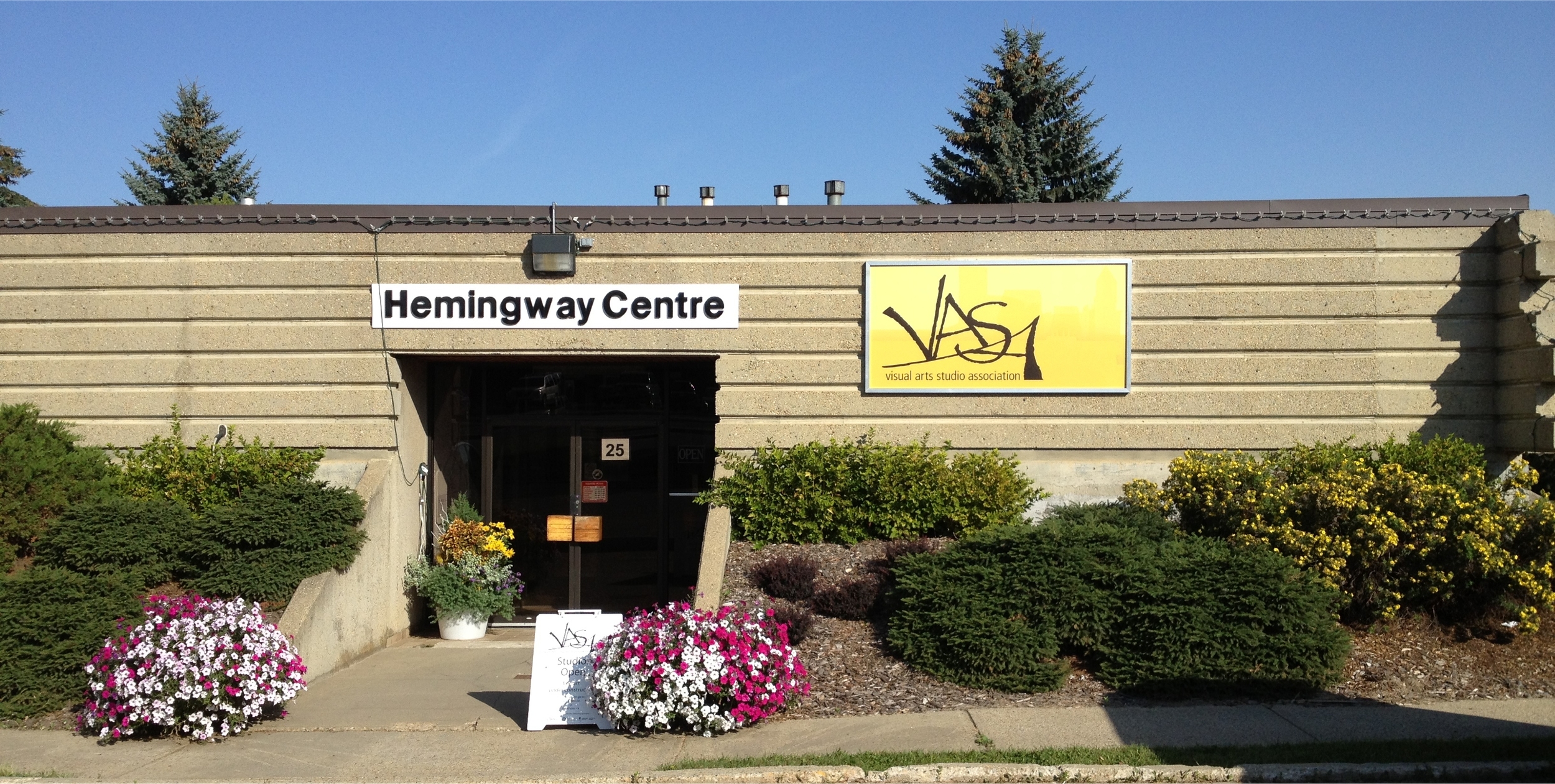
The building that the Visual Art Studio Association is in, is now branded so that people from far and wide can find us.
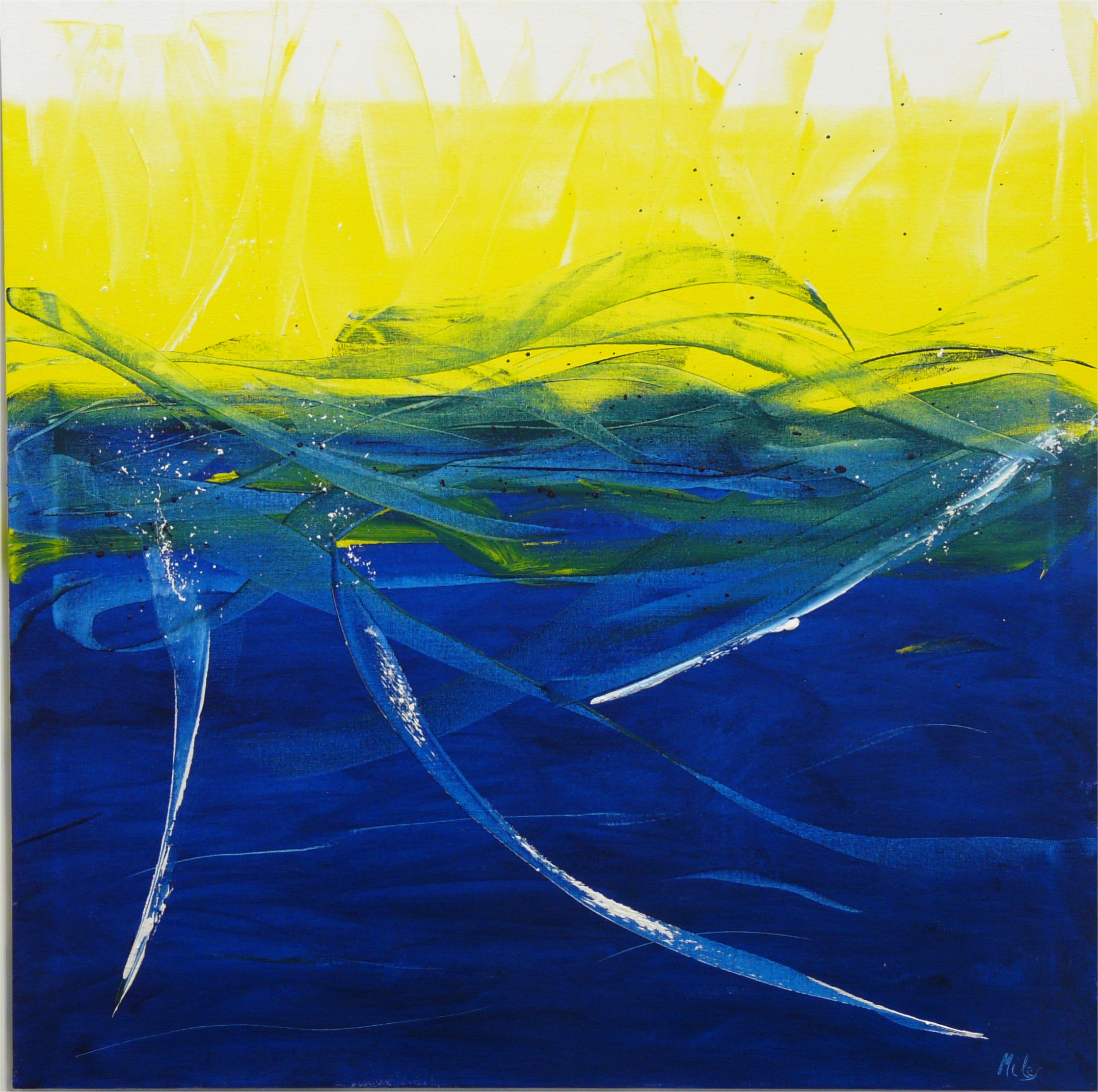
Blue and Yellow = Spring No 10
30x30, oil $750
First up for the New Year is a continuation of my Blue and Yellow series. Someone asked why I was doing so many in this series. I had two answers. Number one, they continue to interest me in that using only 3 colours is a definate challenge to produce interesting art. Number two, I bought LARGE tubes of blue and yellow paint and I have to use them up.
This painting has a definate aquatic feel, the downward streaks of white almost like divers entering the deep blue. What do you see?
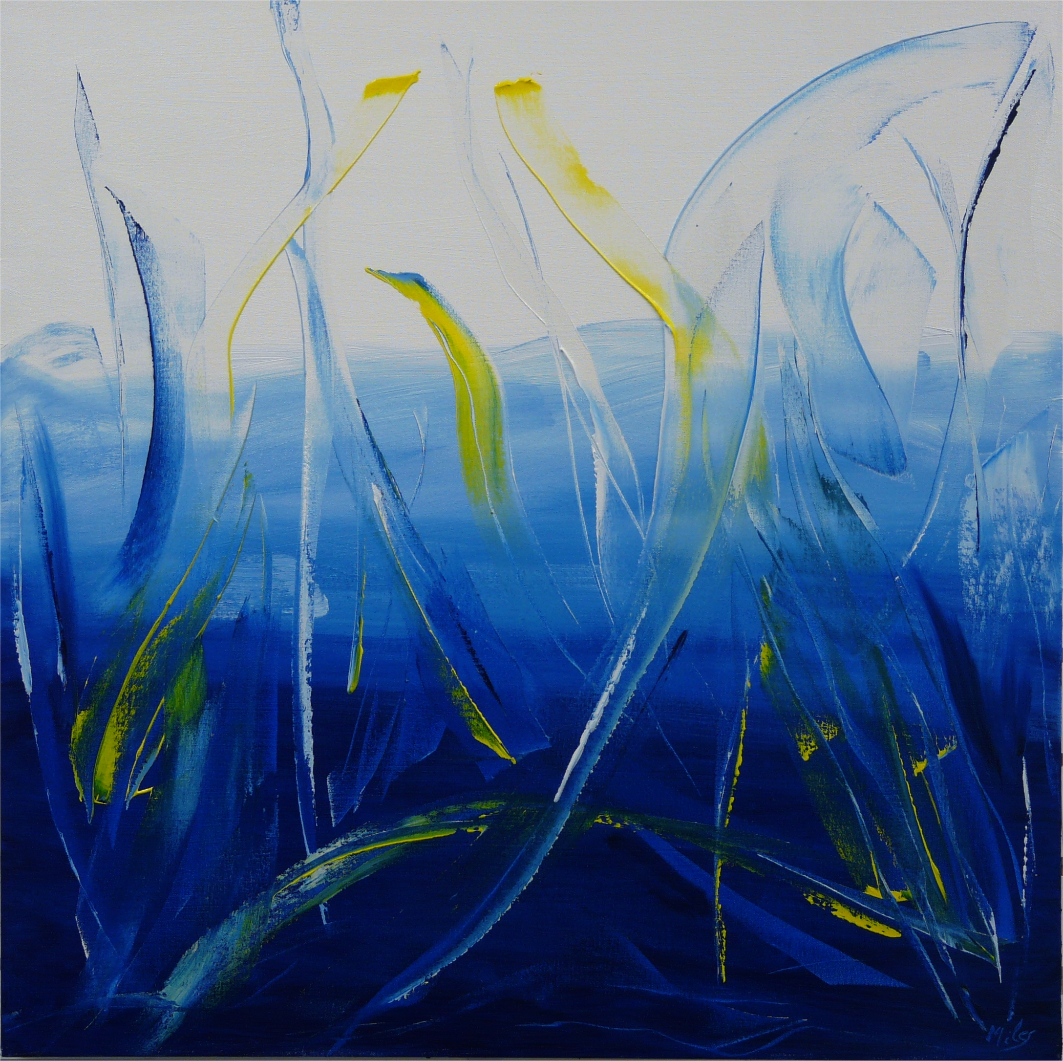
Blue and Yellow = Spring No 11
30x30, oil $750
Number 11 is light, very balanced with the two yellow "stalks" complimenting each other. It's not nearly spring yet, but this feels like it in this painting: light, airy and happy.
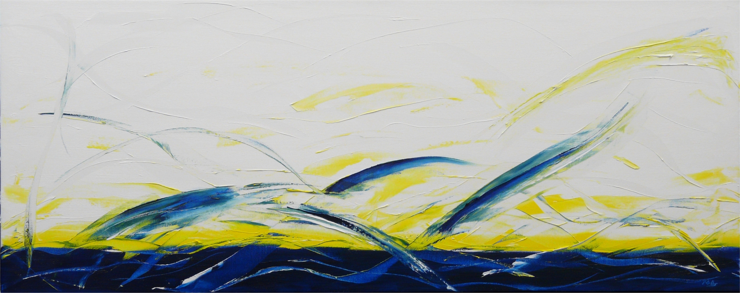
Blue and Yellow = Spring No 12
55x22, oil $925
Well, this one was a challenge just to fit on the page. To paint as well, as it is 55 inches across, I had to maintain a flow across a wide canvas that was very narrow. The white section at top is fairly subtle, with white on white cut-outs to create interest. The image does not do justice to it, or to any of my paintings. Come to the Daffodil Gallery or my studio in the Hemingway Centre to see them up close and personal.
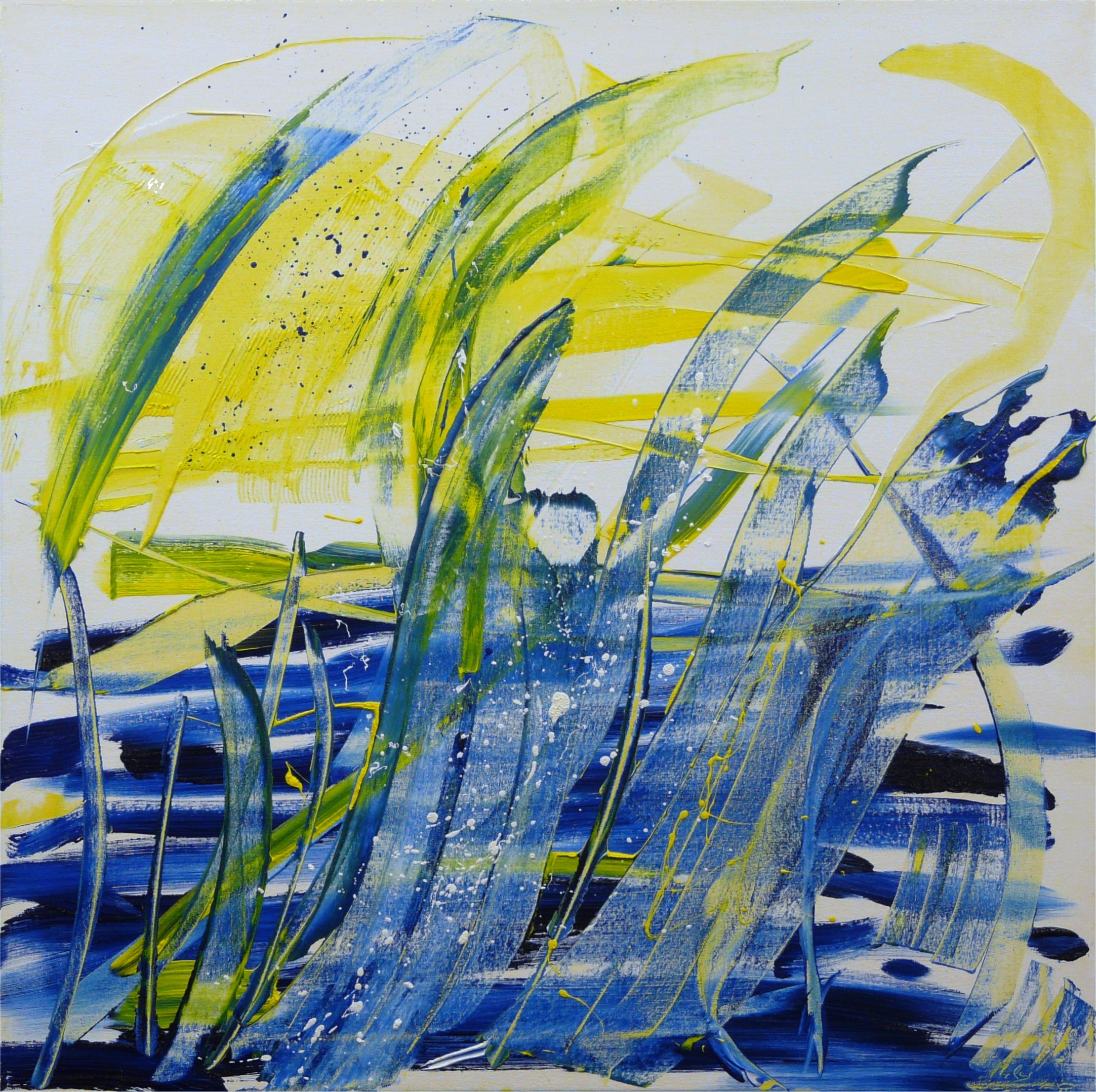
Blue and Yellow No 14
30x30, oil SOLD and donated to the Lois Hole Foundation.
Back to my "Swedish Series". If you are counting the series I skipped one number of ill repute. My first thought was to call it 14 - 1. This is a delightful confection with yellow and green sprays rising into the white with what might be a sunburst to the left. I used a yellow under colour, let it dry and applied paint over it to give more complexity and colour underneath. Note also, the subtle change in name, now that spring is a possibility I've dropped it from the series. This one was sold through silent auction at Night of Artists and the proceeds donated to the Lois Hole Hospital for Women.
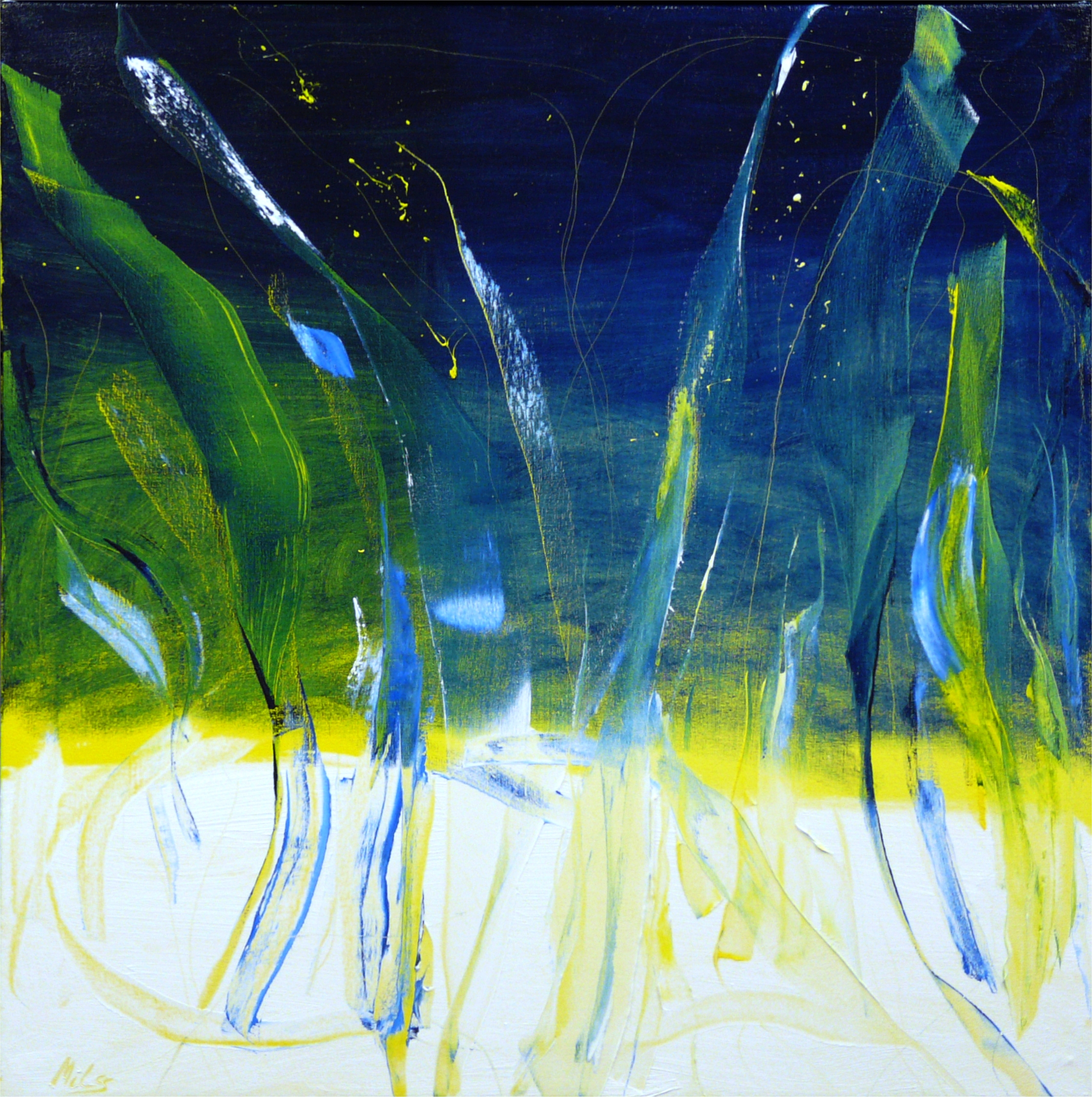
Blue and Yellow No 15
30x30, oil $750
I very much like this one, it's more reminiscent of northern lights, which is coincidental with another artist in our studio doing a northern lights series. I wonder which came first? Again there is an under-colour of yellow, varied from left to right in intensity. Once dry I applied more paint over it. To add interest I dragged the corner of a paint knife through the blue to reveal the yellow.
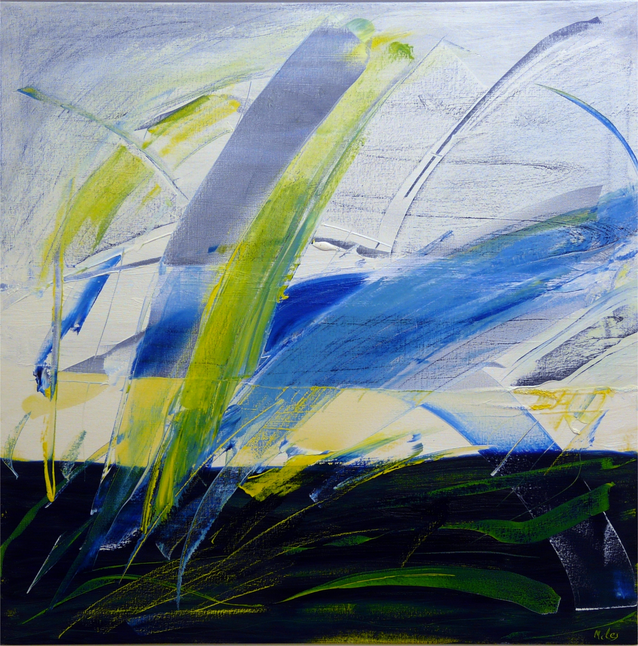
Blue and Yellow No 16
30x30, oil $750
Another in my "Swedish" series. I like the bold sweeping marks and the scraped-bare look of the upper corner. The top portion was under painted in blue with white applied over it once dry, then I scraped the white back so that it was barely there. I used an old credit card, they're great being small and flexible.
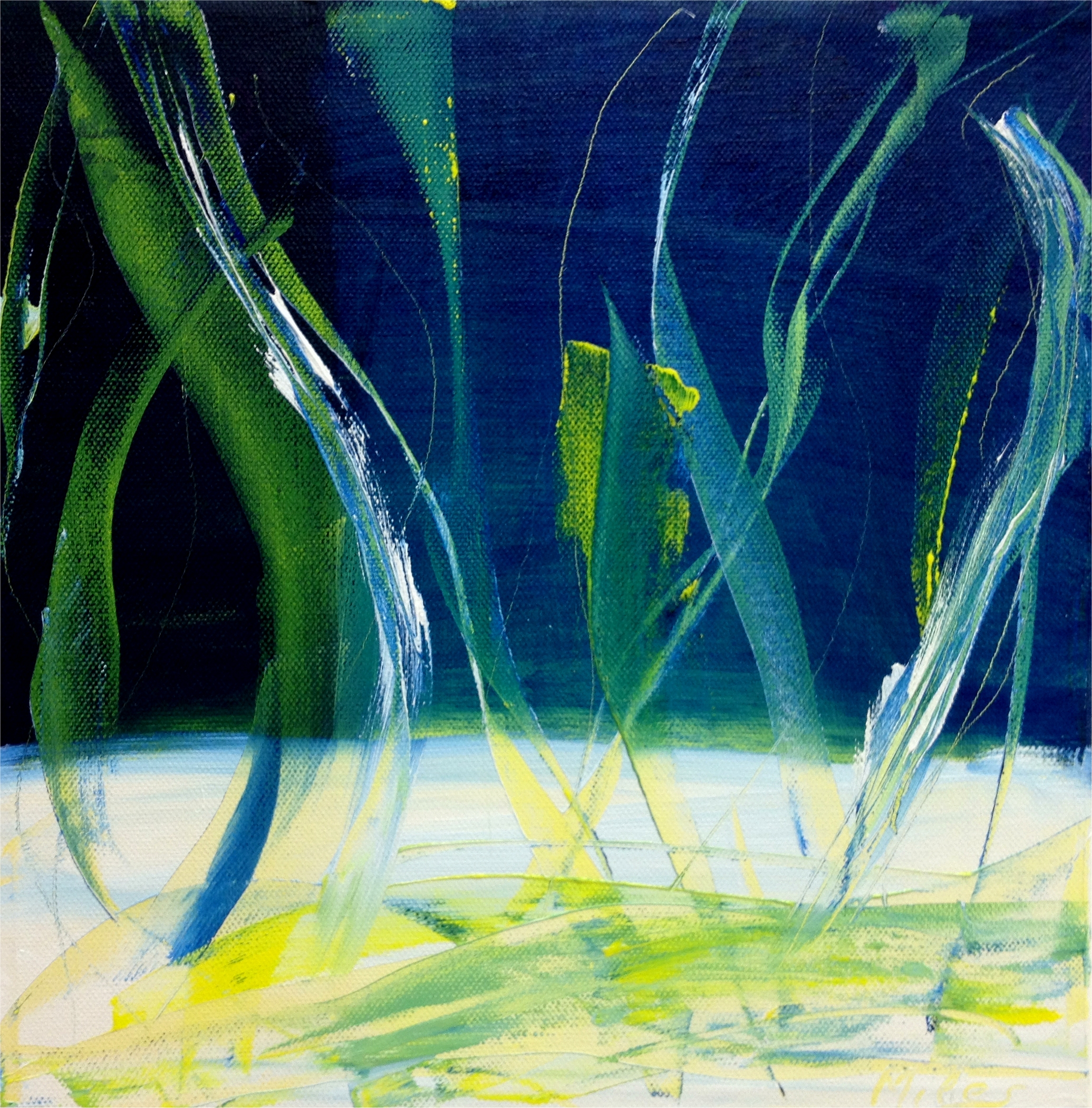
Blue and Yellow No 17
12x12x3, oil Gifted
A small and thick work that is a variation on a larger work (No 15). Done for the Art Gallery of St. Albert's Square One sale coming up in June. Be there or be SQUARE!
As no one was compelled to buy my work I gifted it to a wonderful cousin from the US. If you snooze you loose! I promote the purchase of art as an act of self-gratification, indulgence and impulse.
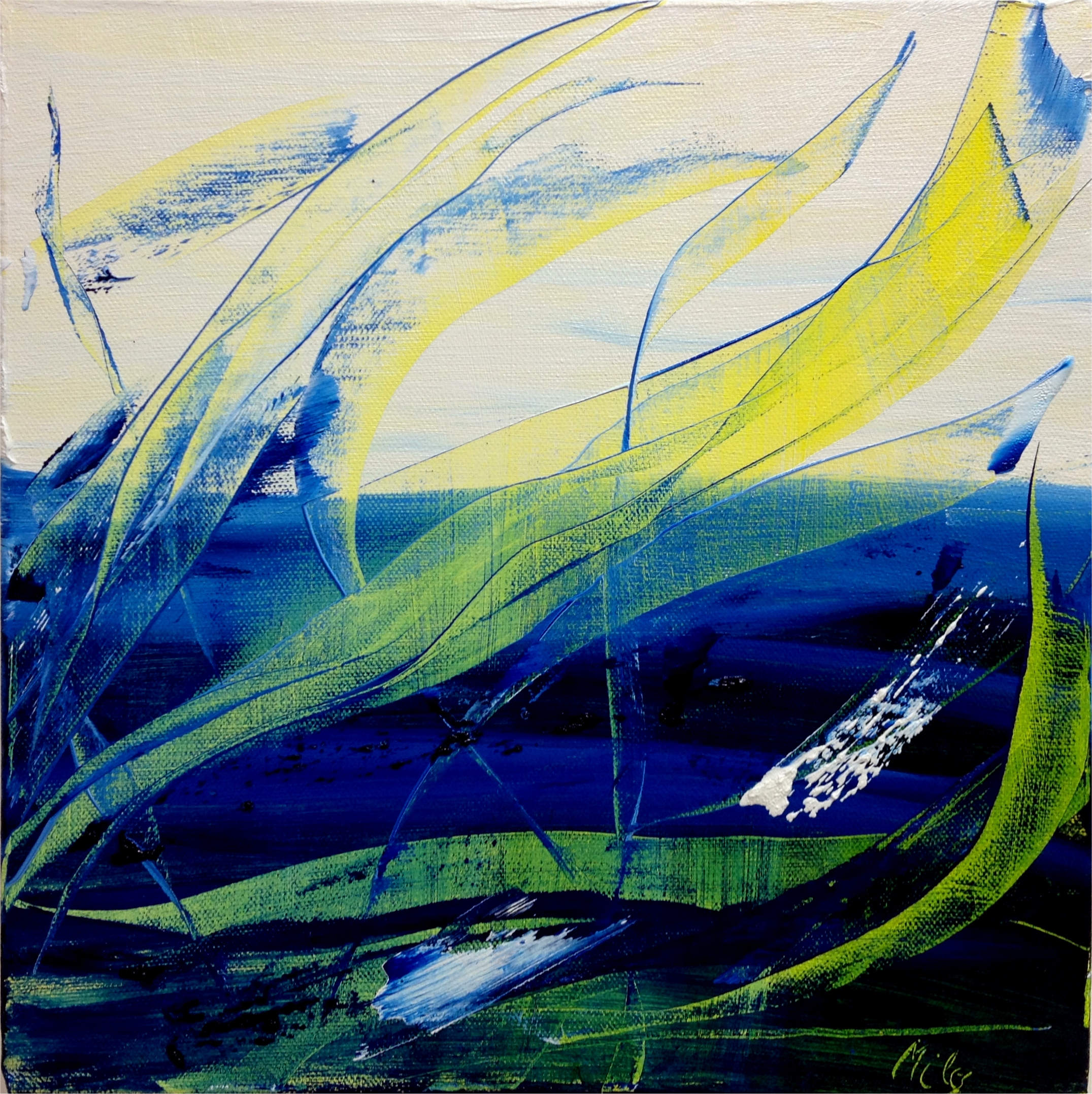
Blue and Yellow No 18
12x12x3, oil Gifted
A small and thick work. Done for the Art Gallery of St. Albert's Square One sale coming up in June. Be there or be SQUARE!
As no one was compelled to buy my work I gifted it to a wonderful cousin. If you snooze you loose! I promote the purchase of art as an act of self-gratification, indulgence and impulse.
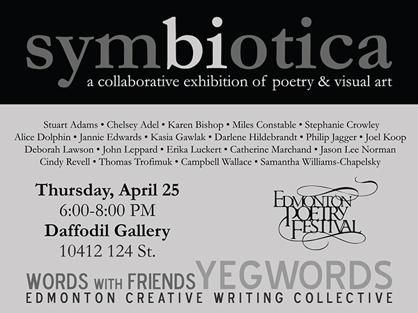
We came up with a concept of a layered "painting" with the front layer being transparent with the words on it. I used plexiglass attached to struts that go through the canvas and into the support underneath. The words of the poem were printed on sticky film and carefully applied to the backside of the plexiglass. I placed letters to spell out the title of the poem up the side of the canvas, then applied a thick layer of black and white acrylic through which I pulled the letters to leave the unpainted canvas, now in the shape of the letters. Application of gold and some black on the title helped to knock back the gold somewhat, and I hit the plexiglass with a bit of gold spraypaint and added touches of gold to the dried acrylic paint. It was fun, and challenging, and gave me a whole new approach to conceptual presentation of ideas.
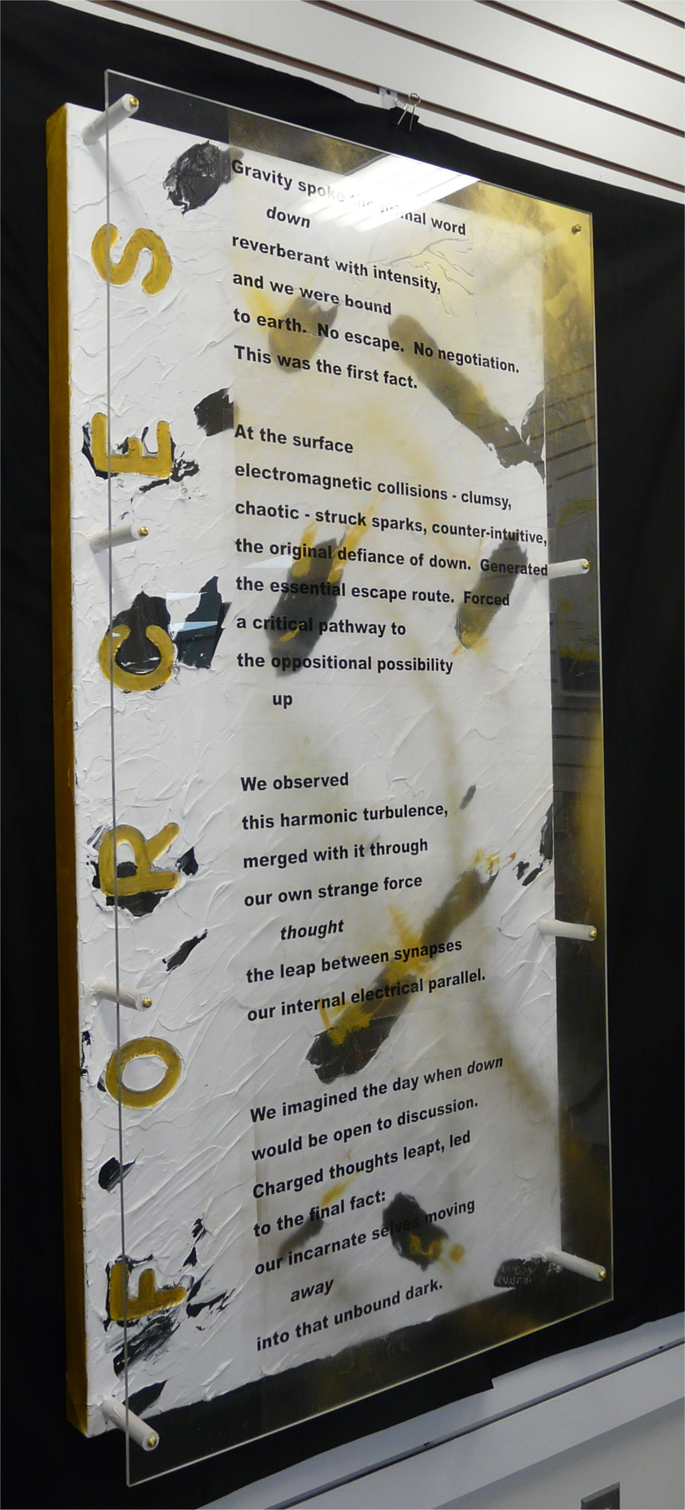
Forces
24x48x6, acrylic on canvas, Plexiglas, wood, brass and written word. $1,150. On loan to the Library in Stoney Plain.
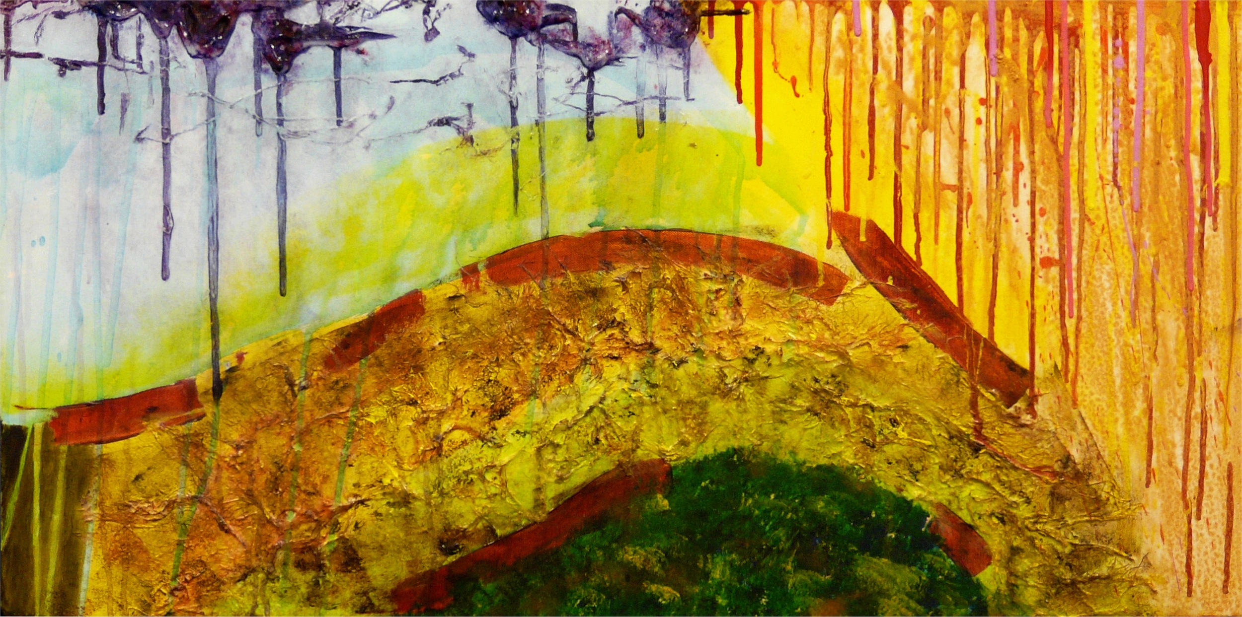
Genesis
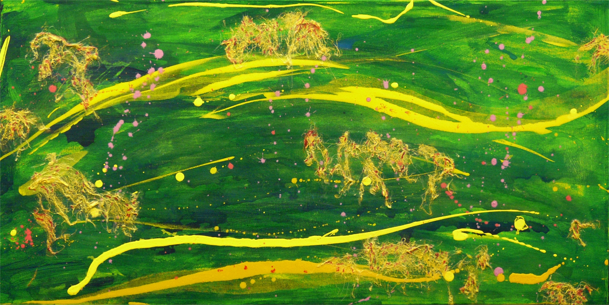
36x18x3, acrylic and Mulberry paper $400
I just had to take a break from blue and yellow, I think I was going colour blind. In "Genesis" I return to a long series of imaginative landscapes I have done over the years. I find the size and thickness of the canvas fascinating as they are 3 inches deep and really stand out on a wall. Why "Genesis"? I'm not sure, but it feels very protoplasmic. The start of something.
Sargasso
36x18x3, acrylic and Mulberry paper $400
Another imaginative "landscape", although there really isn't anything that even looks like land in "Sargasso". The swirling action in the painting prompted the name. That calm area in the middle of the Atlantic. Other people have seen very different things in "Sargasso", but I won't mention what. You decide for yourself.
In early May Rick Rogers and Peter Gegolick proposed to start a new, ad hoc, totally fun painting group of abstract artists who wanted to work with thick, goopy, layered paint. Of course, the name was to be The Goop of Seven. What a scream! I was in without having to think of it. Anyways, we have put together a series of workshops for the growing number of goopy artists. I experimented with Liquitex Pouring Medium for several months now, it's great stuff with a lot of interesting effects possible with different handling and paints. Enjoy, I certainly am!
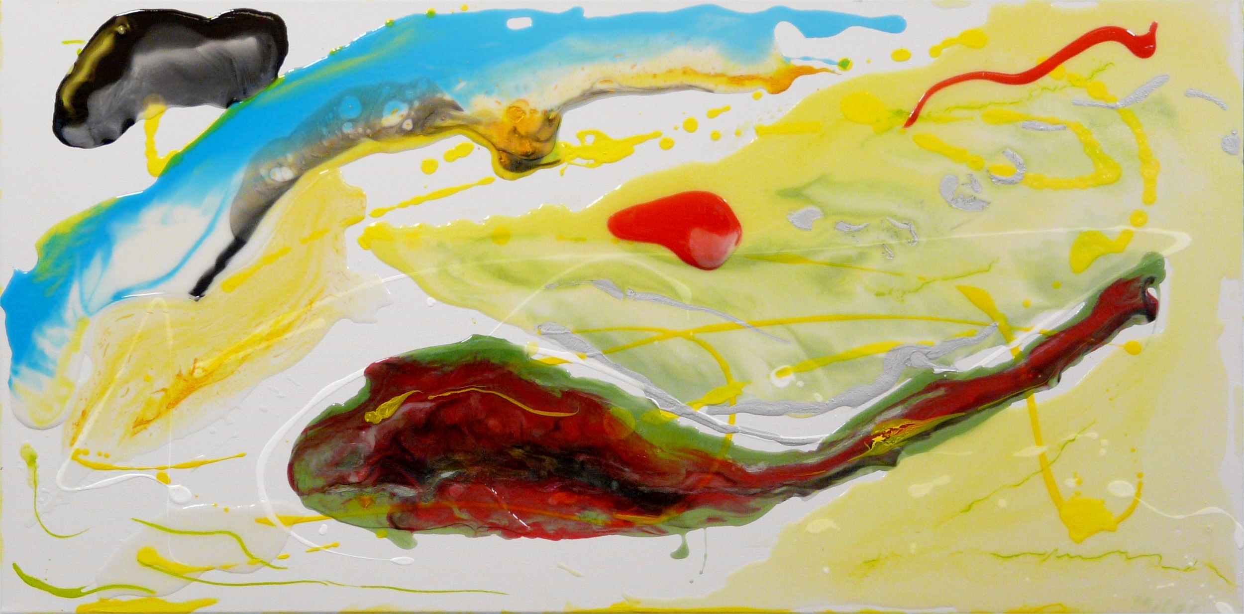
Testing. Testing. 1 2 3
18x36. Acrylic. SOLD
This was my first piece done with pouring medium. I didn't have a concept or plan in mind, I was just putting paint on the canvas and pouring, dripping, drizzling and spattering medium and paint. Layering with pouring medium is really interesting. Different effects can be achieved by pouring medium over the dry paint or wet paint; by drizzling paint into and onto the medium layer. Different acrylic paints behave differently in the medium. This is great stuff, stay tuned.
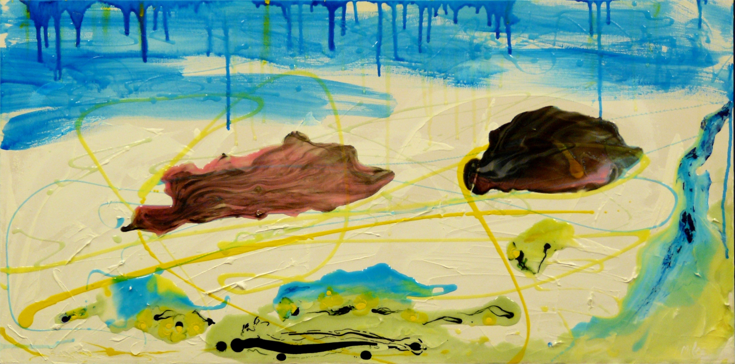
Testing. Testing. 2 3 4
18x36x3. Acrylic. $400
Second piece with the new toys. I laid down streaks of heavy paint and medium and let them dry before working with pouring medium. I'm amazed at the transparency of the pouring medium even with other paint in it. As well, the paints don't actually mix to form new colours when in pouring medium, cool and unexpected. A lot of this seems related to fluid dynamics.
NEW SERIES
My new series is composed of very abstract paintings that I am naming after pieces composed/played by jazz master, Miles Davis. "Why, you ask?" Because I am a huge fan of Miles Davis and often listen to his jazz music while painting. These works will be shown in June 2014 at the Daffodil Gallery. Miles does Miles. Look for it!
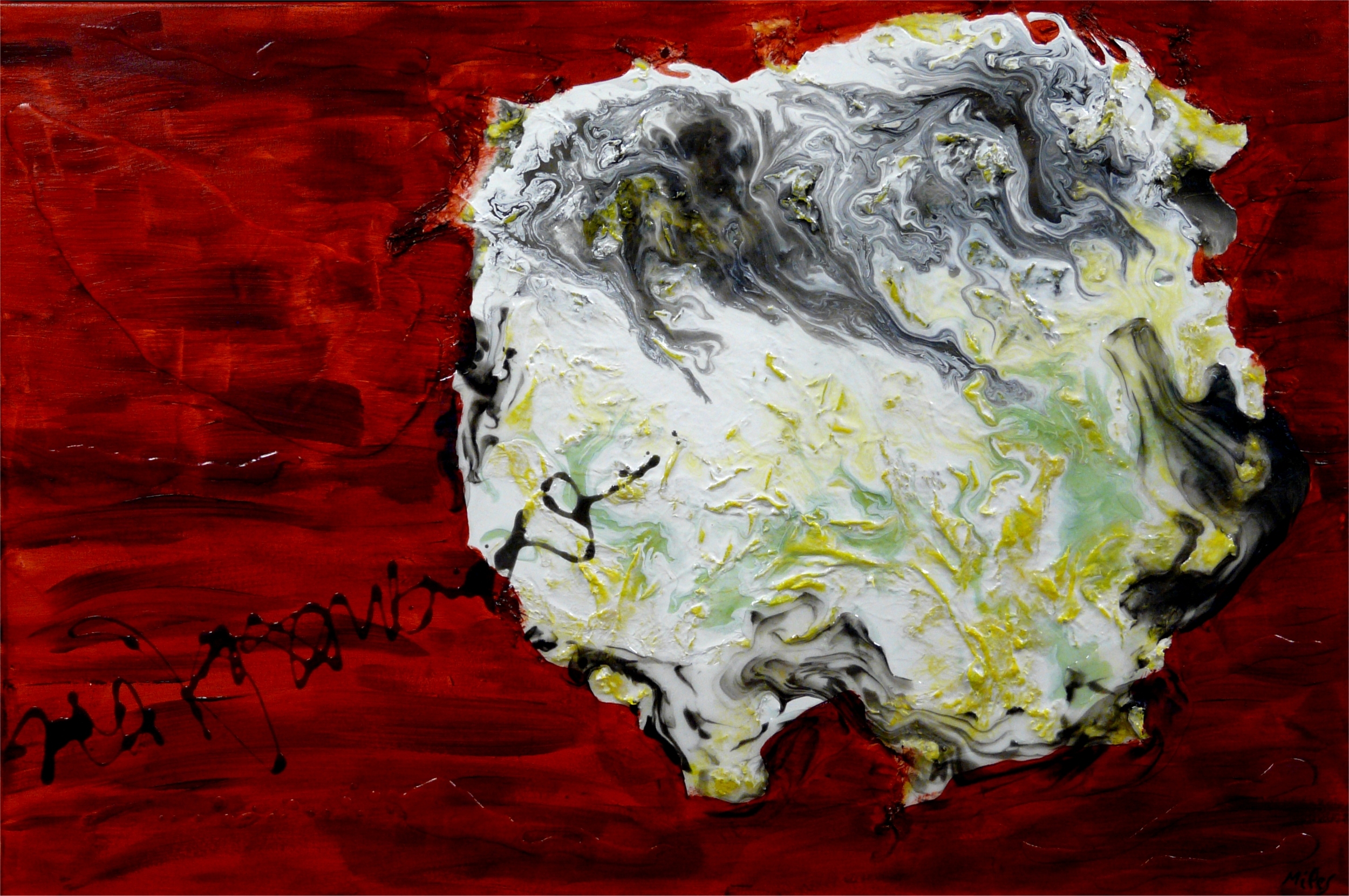
Bitches Brew
24x36x2. Acrylic. $600
This is my first serious attempt at using the pouring medium and heavy texture achieved with mulberry paper. The photo doesn't really show the almost invisible blobs that show up with high lights and shadows that add interest throughout the red sections. The squiggly gray line ties together the two sections. The title is, of course, "Bitches Brew" after the album of the same name.
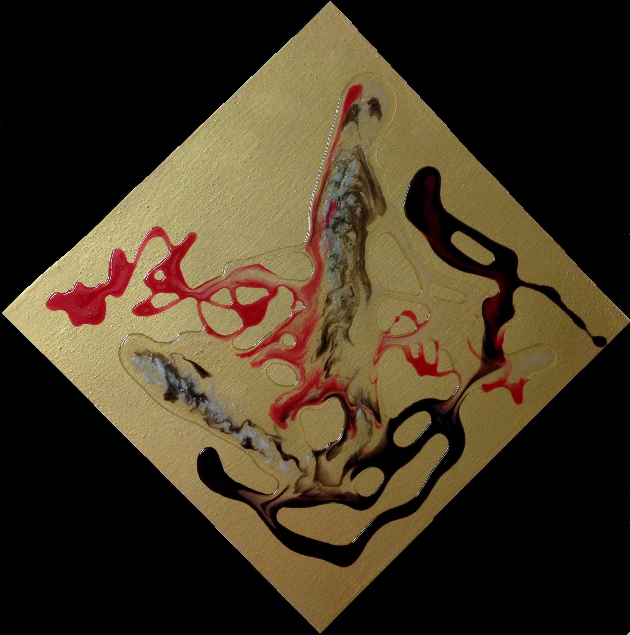
Limbo
12x12x2. Acrylic on wood. SOLD
Connie Osgood supplied the wood panel and some glass bead gell for me to try, so I promptly spray painted the panel with gold. Seemed reasonable to me! I kept the following design simple, and yes there is bead gell in it. I have decided to name the following series after song titles from Miles Davis. I absolutely love his music. I think he was the most innovative, imaginative and influential musician since Mozart. And terribly abstract in approach. So, this one is Limbo.
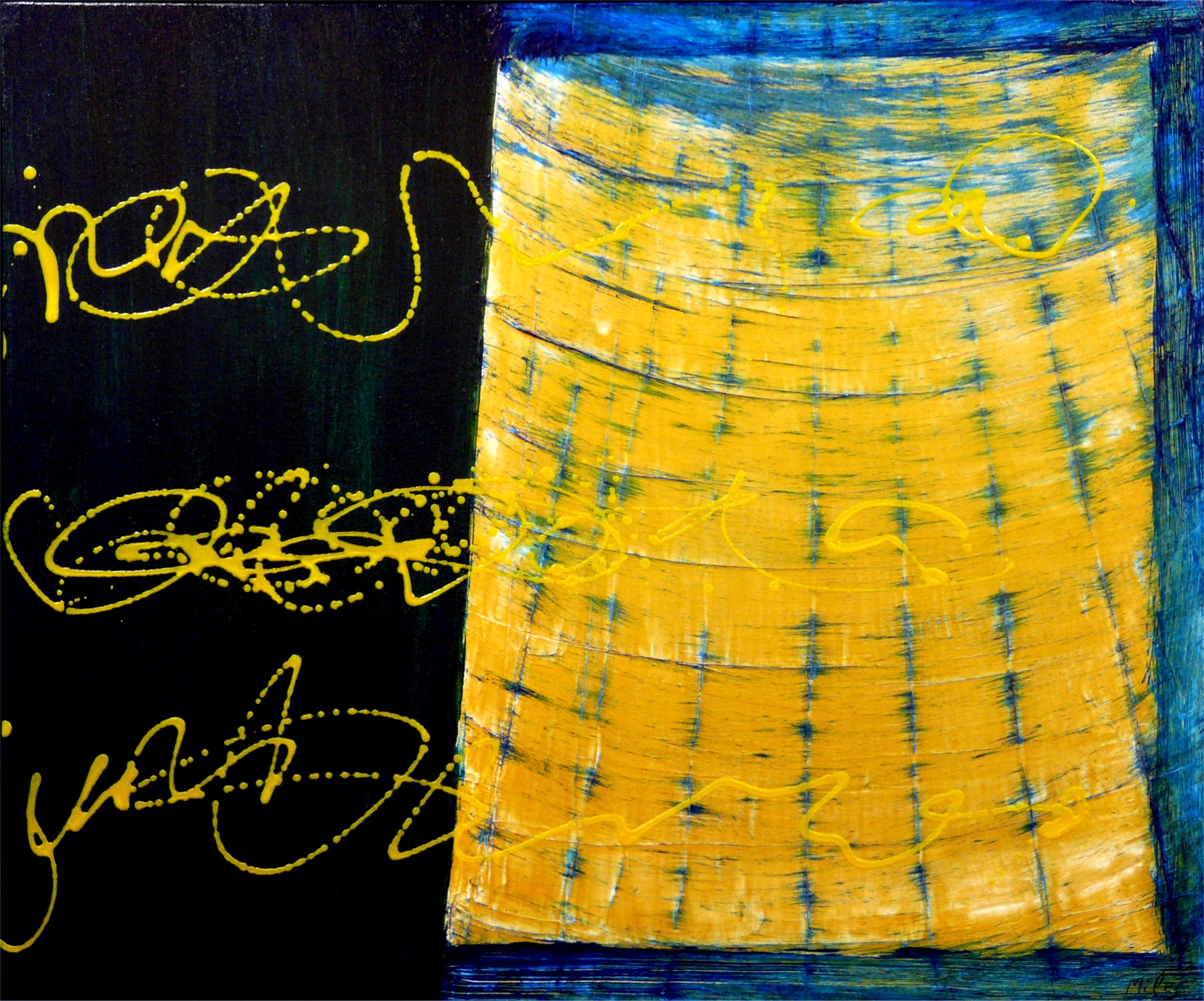
Blue in Green
30x30. Acrylic. $600
This painting originally started as part of an earlier series on buildings, but it just didn't come together so I moth-balled it for several years. Not wanting to throw out a good canvas I applied green and then blue mixed with pouring medium over the left side to cover a geometric shape. The gold side stumped me for a long time, but then I decided to simply sweep the same phthalo blue over it, using ... a BBQ brush. The final design came as a way to unify the two sides using gold squiggles. The women in the studio thinks it looks like a sonogram. Cool! Blue in Green.
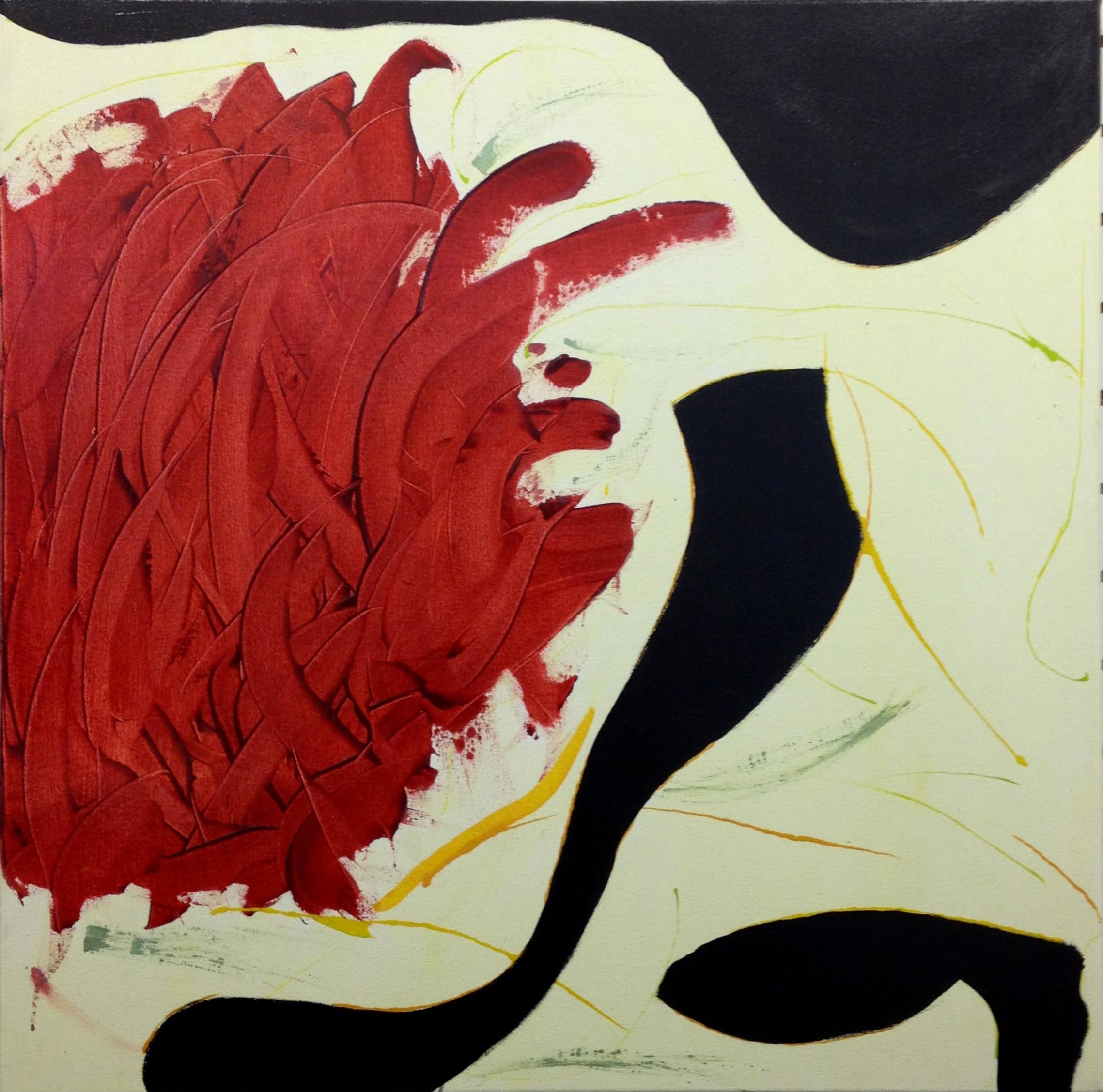
Jehru
36x36x1. Acrylic. $720
I started with the light yellow/green background, then applied the heavy, funky, swirling lines. This stumped me for some time, so I added little swirly bits in yellow and green and waited for inspiration (hey this ain't easy stuff). It did finally come ... add black. So I did! I pumped up the red with layers of pouring medium, although you can't see it well in the photo. And yes, for you other Miles Davis afficianados I spelled Jeru wrong. This is art, after all.
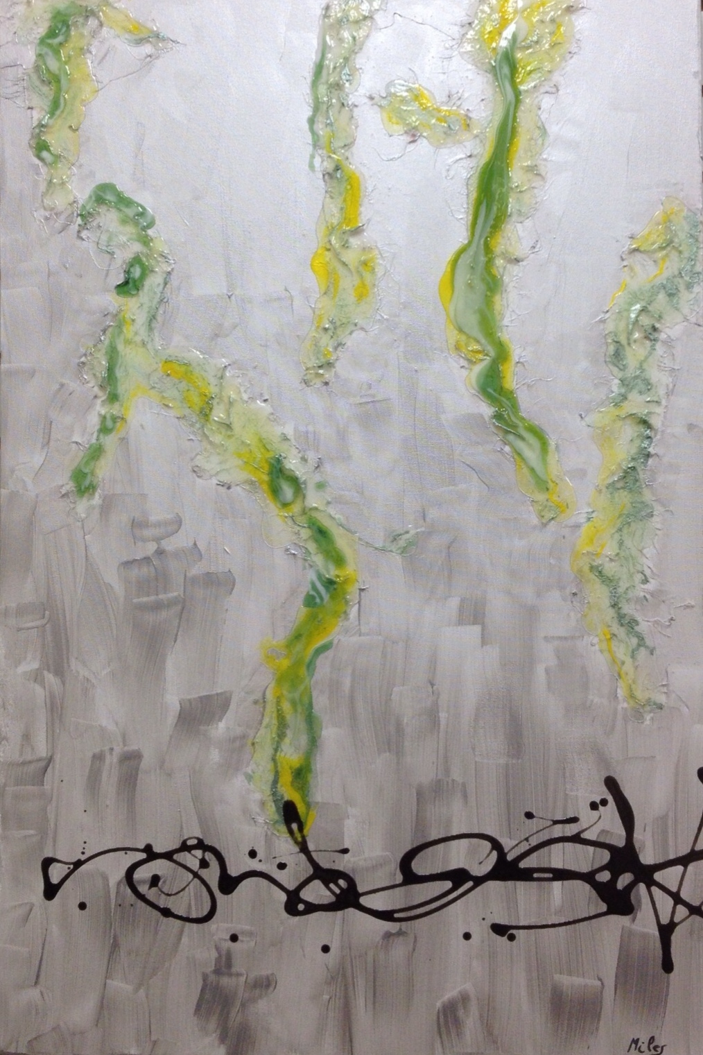
Spanish Key
24x36x2 Acrylic. $600
A very bright, silver and green piece. The green reminded me of "Old Man's Beard" lichens from mangrove swamps, so the name, Spanish Key, is reminiscent of hot, wet climates.
Pfrancing
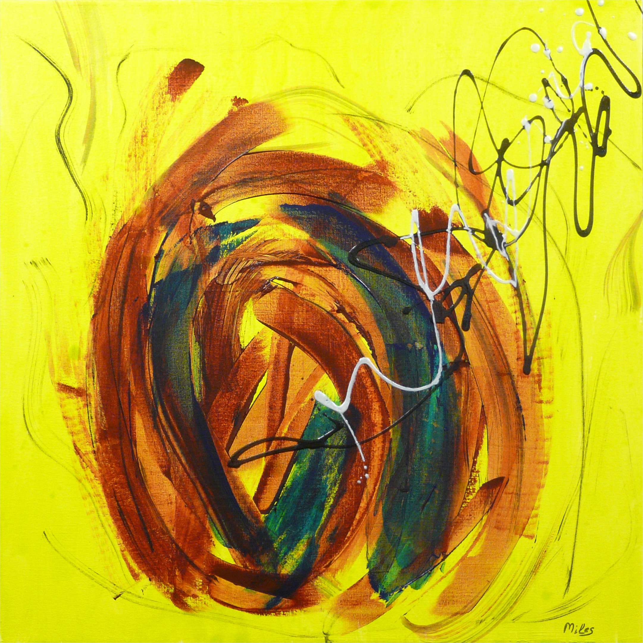
30x30x1. Acrylic. $600
Yes indeed, that is bright yellow-green. Seems to fit the title, Pfrancing. Prancing? In France? Prancing in France!
Boplicity
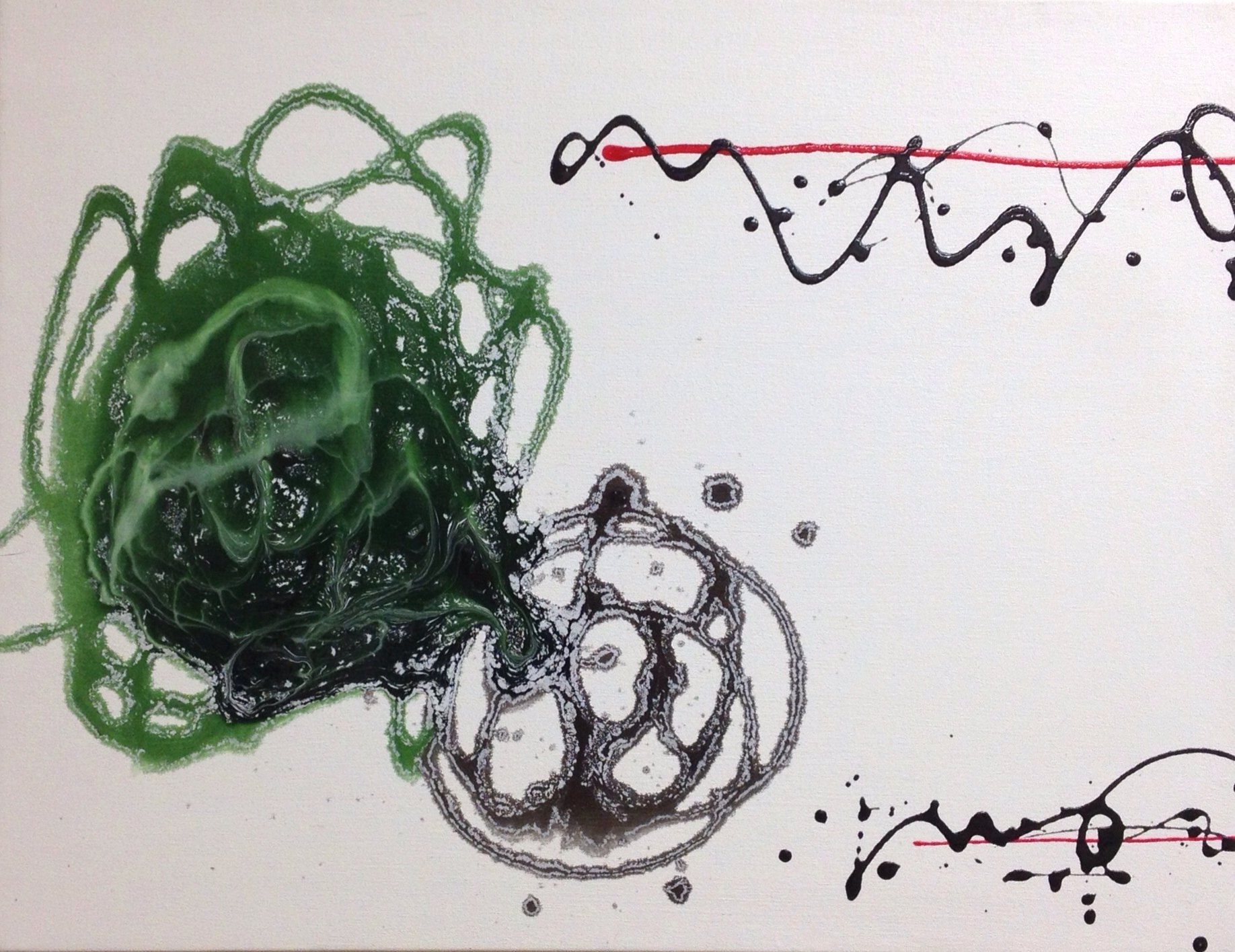
20x26. Acrylic. $460
I created a cool effect, quite by accident, such is the nature of experimentation, by adding swirling lines of tinted pouring medium to a very wet, white canvas. The pouring medium lifted the white paint, which then spread and settled into the swirls. This I am going to work with some more. Too cool to ignore.
Rouge
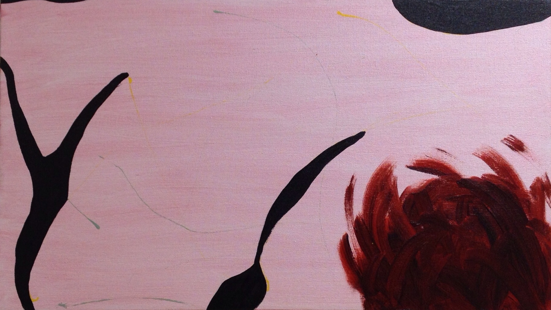
16x28x1. Acrylic. $440
A very pink piece using the red flower-like image. Not sure what it's about, but it creeps up on you.
Pharaoh's Dance
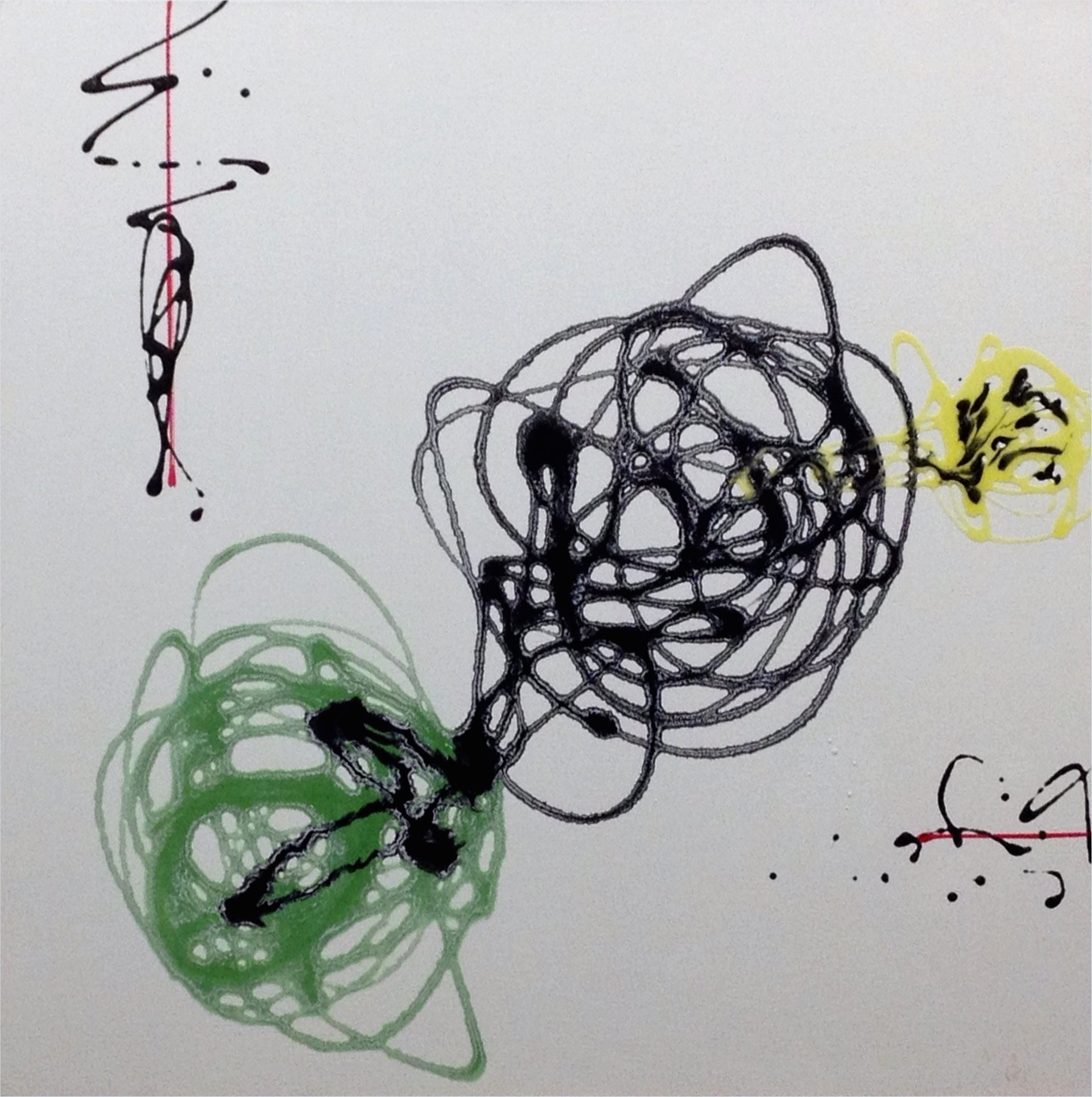
30x30 Acrylic. $600
Another, but larger, piece using the swirling effect. The caligraphic and straight lines are added for counterpoint.
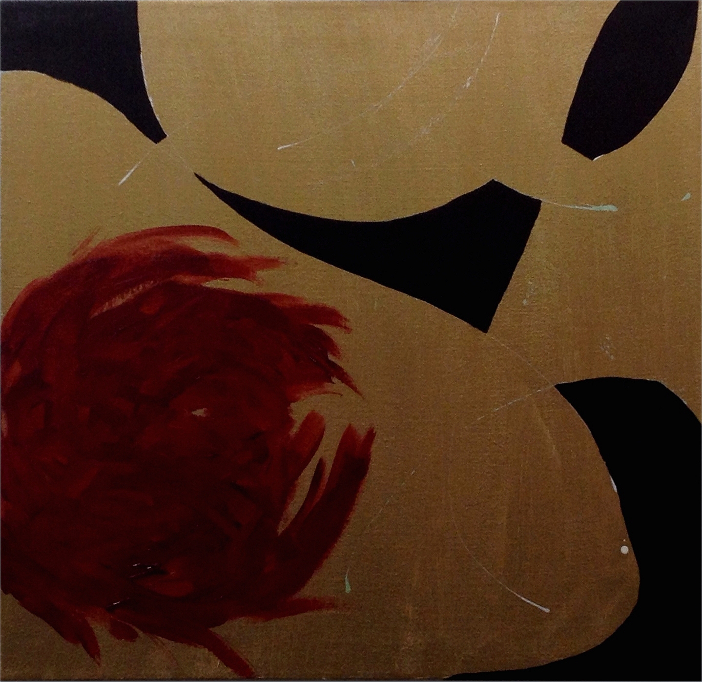
Budo
30x30 Acrylic. $600
A red floral-type motif on bronze. Unlike gold, the bronze makes for a darker image, although one that is still definately metallic.
